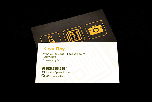
 Side 1 | Side 2
Concept
This one was actually a much more fun and casual project. A long-time friend of mine was looking for a business card designed, and, knowing that I literally do this for a living, he asked if I wouldn't mind making him one.
Method
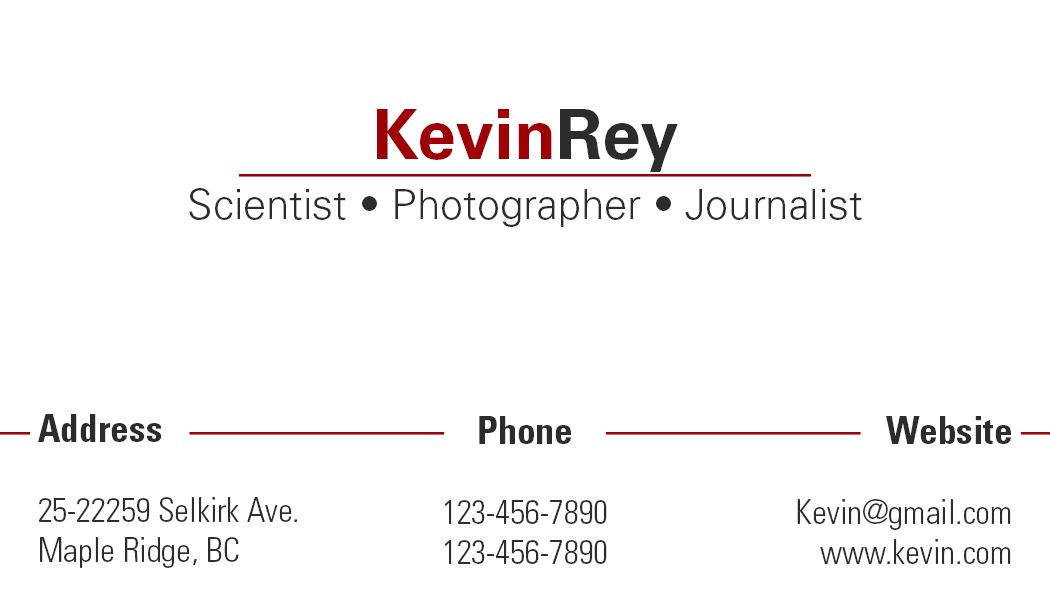
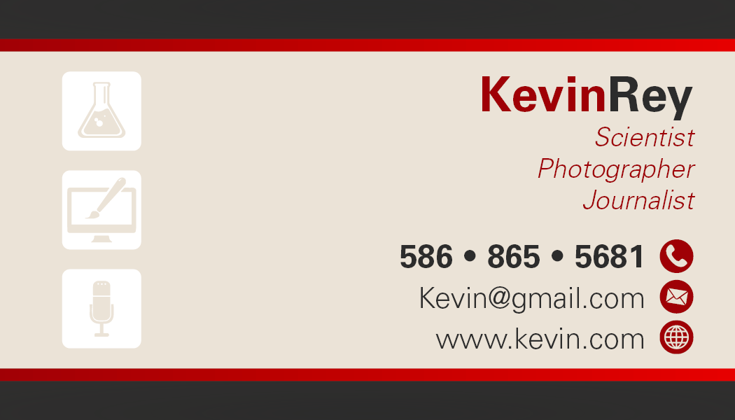
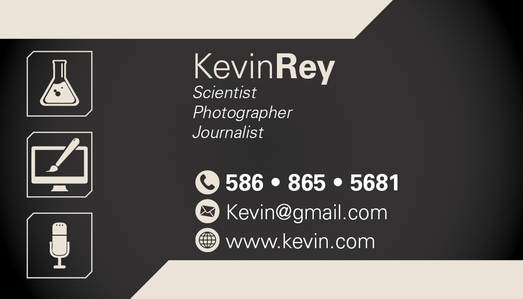
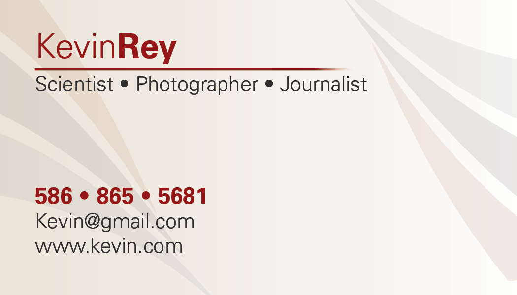
I asked him a few questions about what he was looking for, such as colors, fonts, and general style. He wanted some nice iconography on the back (the three images) since he was using this card for a few different jobs: journalism, photography, and science. For colors he said he wanted dark red, dark grey, and white, and as a stipulation, he wanted the side with his information on it to be a light color so he could write things on it. Now, as a designer and his friend, I gently advised him that this color combination wasn't great. I recommended instead to him an orange/grey color scheme. He said to give it a shot, so I did. For the first round I had a pretty clear idea of what he wanted on the back but the front was pretty much up to me, so I gave him a few different options for that.
Like I said the Back was pretty much approved out of the gate. After seeing the orange and grey in action he decided to go with that, and after a few text tweaks it was ready to go!
Reflection
Overall this was a very fun and relaxed project, and felt more like one of my personal projects than a work thing. Business cards are easy and fun and working with one of my friends was a good time all around. In the end he was quite happy with it and so was I!
